Alum’s typeface recognized by nation’s oldest professional design association
Chalermpol “Pol” Jittagasem created a typeface to help English language learners with pronunciation
Chalermpol “Pol” Jittagasem (M.A., ’21) created a typeface that tells a story about the immigrant experience, a story he knows well. An immigrant from Thailand, Jittagasem came to the United States 10 years ago on a student visa and struggled to learn English. Words like “subtle,” “basically” and “half” were confusing.
“I had no idea how many syllables there were and where to put the stress,” he said.
As a graduate student in Design at San Francisco State University and later as a student in a typography certificate program, he developed a typeface to help English learners with English pronunciation. His project recently caught the attention of the oldest professional design association in the nation: Vaja was included in the STA 100, the Society of Typographic Arts’ (STA) annual competition recognizing the 100 most innovative communication designs from around the world.
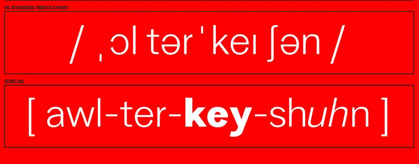
Jittagasem’s typeface, which he named Vaja (meaning “speech” in Thai), was designed to help people learning English phonetically pronounce English words. As part of the STA honor, it is featured on the organization’s website along with the other winners.

He created Vaja in Letterform Archive’s Type West certificate program, but he has been playing around with the concept since graduate school. His thesis project was a typographic design that could help Thai speakers pronounce English words.
“A lot of Thai people have difficulty with [English] pronunciation because it’s a different language, and we have to memorize how we stress here and there. Like the word ‘colonel’ — I don’t know why the ‘l’ is in the middle like that, that’s something you must memorize.” To help, he created small details, or cues, on the letterforms that would tell a Thai person how to pronounce English words.
Language and culture have been through lines in Jittagasem’s work, says SF State Design Professor Hsiao-Yun Chu, who worked closely with him in graduate school. “We take the Roman alphabet somewhat for granted; and yet, for people trying to assimilate and learn a language, it can be very daunting,” she said. “His graduate project created new Thai characters that would help English language learners from Thailand to improve their pronunciation, making the process more inclusive. This is a highly creative and humanistic way to look at the power of typography.”
Vaja expanded his thesis to include all English learners, not just Thai people. The typeface comes in bold, italic and thin, and each style represents different sounds and where to put the stress. For example, the bold style indicates where to put the stress on a word and the italics are soft sounds.
The typeface isn’t ready to be downloaded just yet, but when it is Jittagasem hopes it will be used in dictionaries, English pronunciation flashcards, academic writing and even newspapers. In the meantime, he plans to apply to Ph.D. programs in design and visual communications to take his vision even further.
Related News